Coordinating family outfits on a photoshoot without everyone matching can feel tricky; it’s like you’re walking a fine line between polished and overly planned.
Of course, you want your photos to look connected and intentional, but still show the real personalities that make your family unique. The good news?
It doesn’t have to be complicated or stressful.
With a little creativity and the right approach, you can pull together looks that feel cohesive without looking identical. Whether you lean classic, casual, or a little eclectic, there is plenty of room to express your style while keeping things beautifully balanced.
Here’s what makes coordination work without everything matching perfectly!
Choose a Color Palette That Feels Connected—Not Matched
When you're coordinating family outfits for a photoshoot (without everyone matching), the color palette is where it all begins. The goal here is not to pick identical colors. It’s to create visual harmony that allows every personality to shine without clashing.
Think of your palette as a way to tell your family’s story through color.
A good rule of thumb:
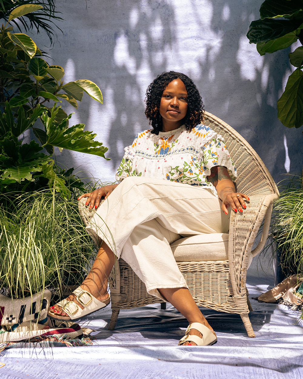
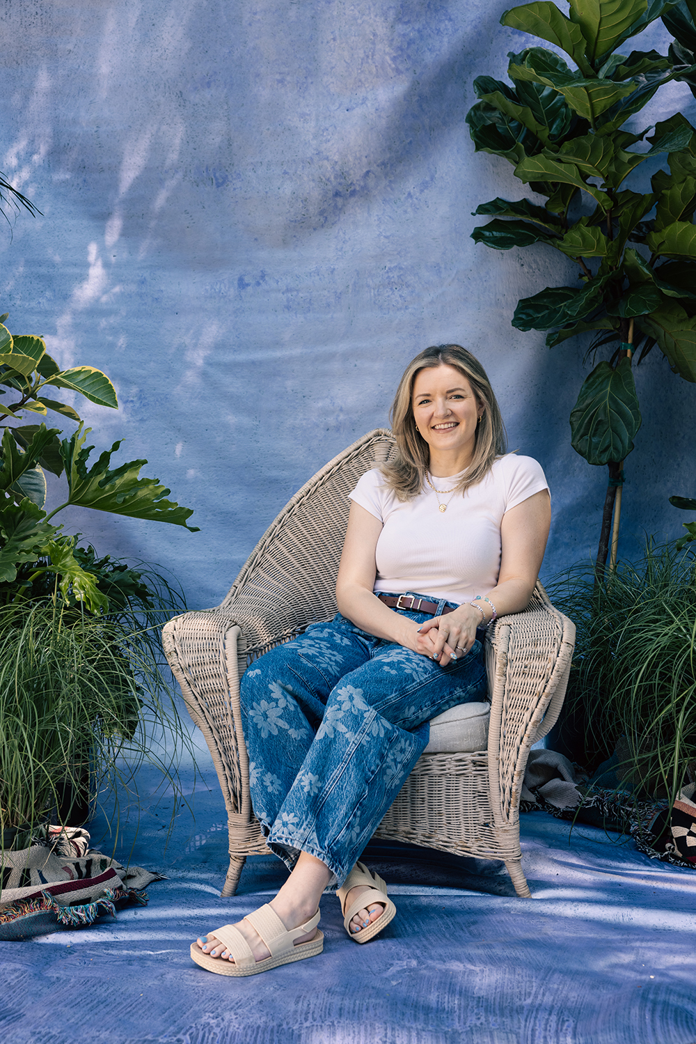
Start with a base of soft neutrals, like cream, taupe, oatmeal, soft gray, or muted white. These colors tend to photograph beautifully in any season and keep the focus on your faces and emotions, not the clothes.
Then, throw in one or two accent colors that feel natural and tied to the environment. If you are shooting outdoors, let nature guide you:
- Fall: Rust, burnt orange, deep green, mustard
- Winter: Forest green, cranberry, camel, navy
- Spring: Sage, blush, lavender, light denim
- Summer: Dusty blue, warm beige, sand, coral
Too many bright or saturated colors may draw attention away from what matters, which is your connection. Stick to tones that feel lived-in and balanced, rather than loud or trendy.
Need help visualizing? You can use a color palette generator like Coolors or search “family photo color palette [season]” on Pinterest. It’s a great way to see how colors can work together across different outfits and body types.
Finally, make sure the palette you choose feels like you. Whether it’s cozy and casual or slightly dressed up, the best outfits are the ones you feel good in. Because when you're comfortable and connected, the photos reflect it.
Ready to bring your color palette and your family’s story to life? FAM NYC offers everything from relaxed, at-home Keepsake sessions to Signature experiences. You can capture your family’s unique dynamic in a way that feels just right.
Start With One Outfit, Then Build Around It
When you're trying to coordinate outfits without looking too matched, the easiest place to start is with one person’s look, and build from there. This simplifies the planning process and sets the tone for your entire session.
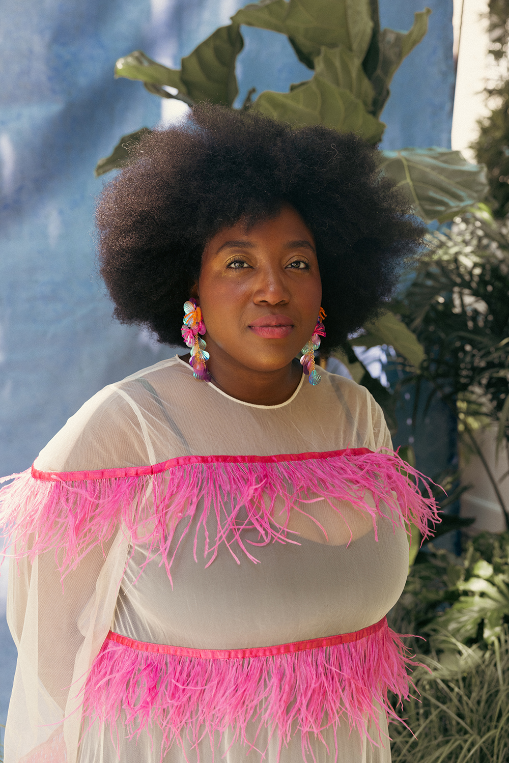
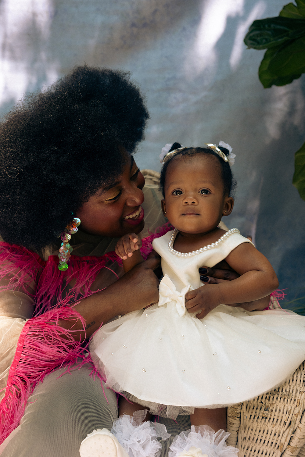
Often, the best outfit to begin with is the one worn by the person who booked the shoot; in most cases, that would be Mom. Choose something they feel confident and comfortable in, with textures or colors that photograph beautifully. Think soft knits, flowing fabrics, or a dress with movement.
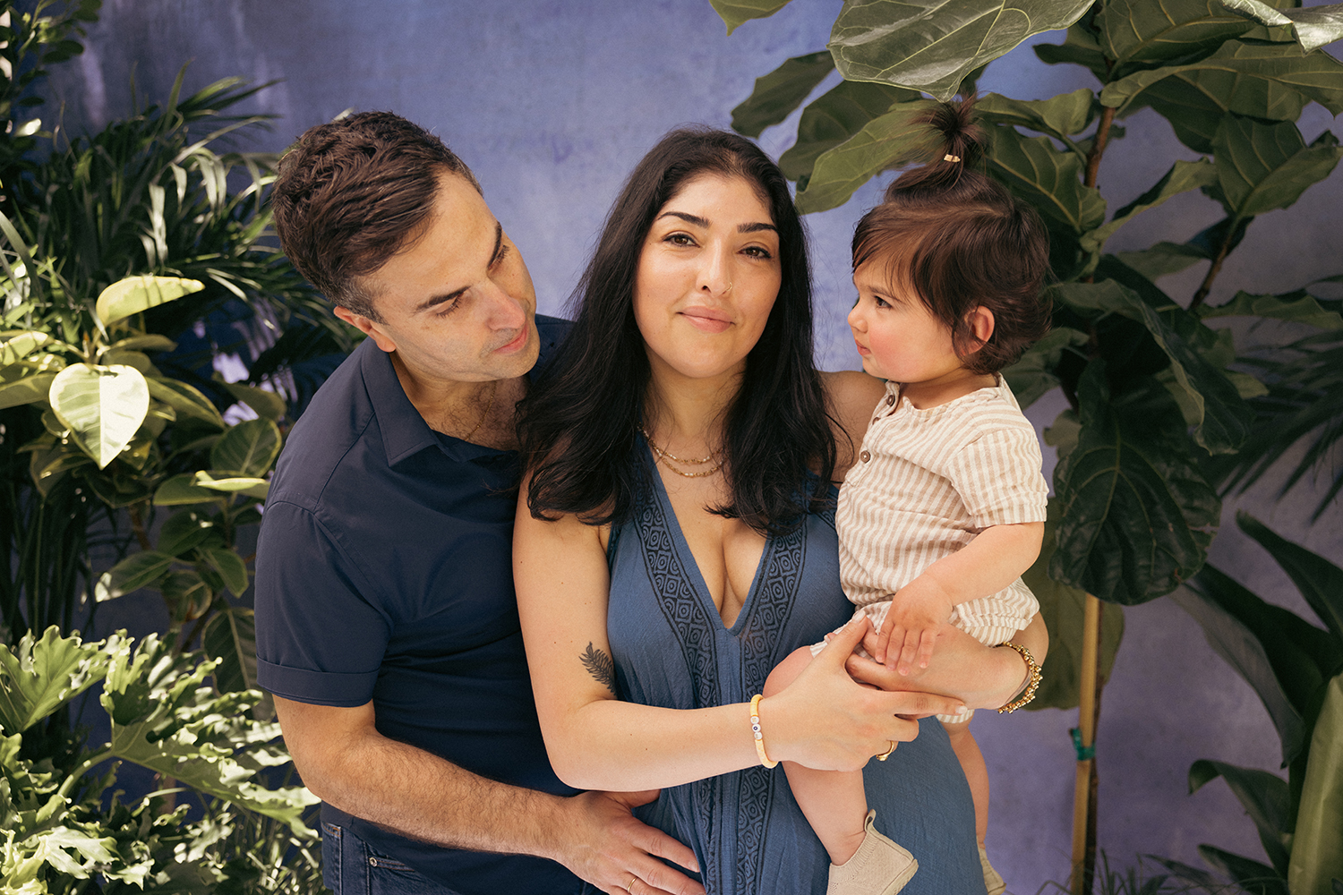
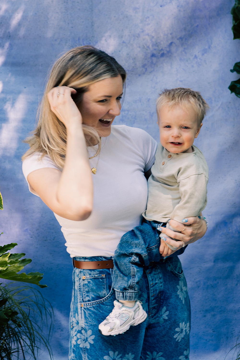
Once that outfit is chosen, use its colors, textures, and level of formality to inspire the rest of the family’s looks.
Rather than matching that outfit exactly, think in terms of roles:
- One person might wear the main color from the anchor look.
- Another might echo a secondary shade in a shirt, dress, or pants.
- Others can tie it all together with complementary accessories, like a scarf, belt, shoes, or jewelry in the same palette.
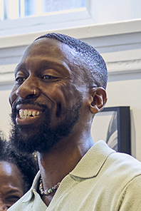
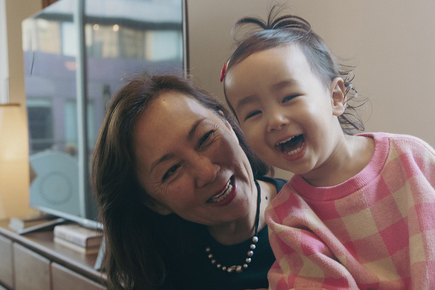
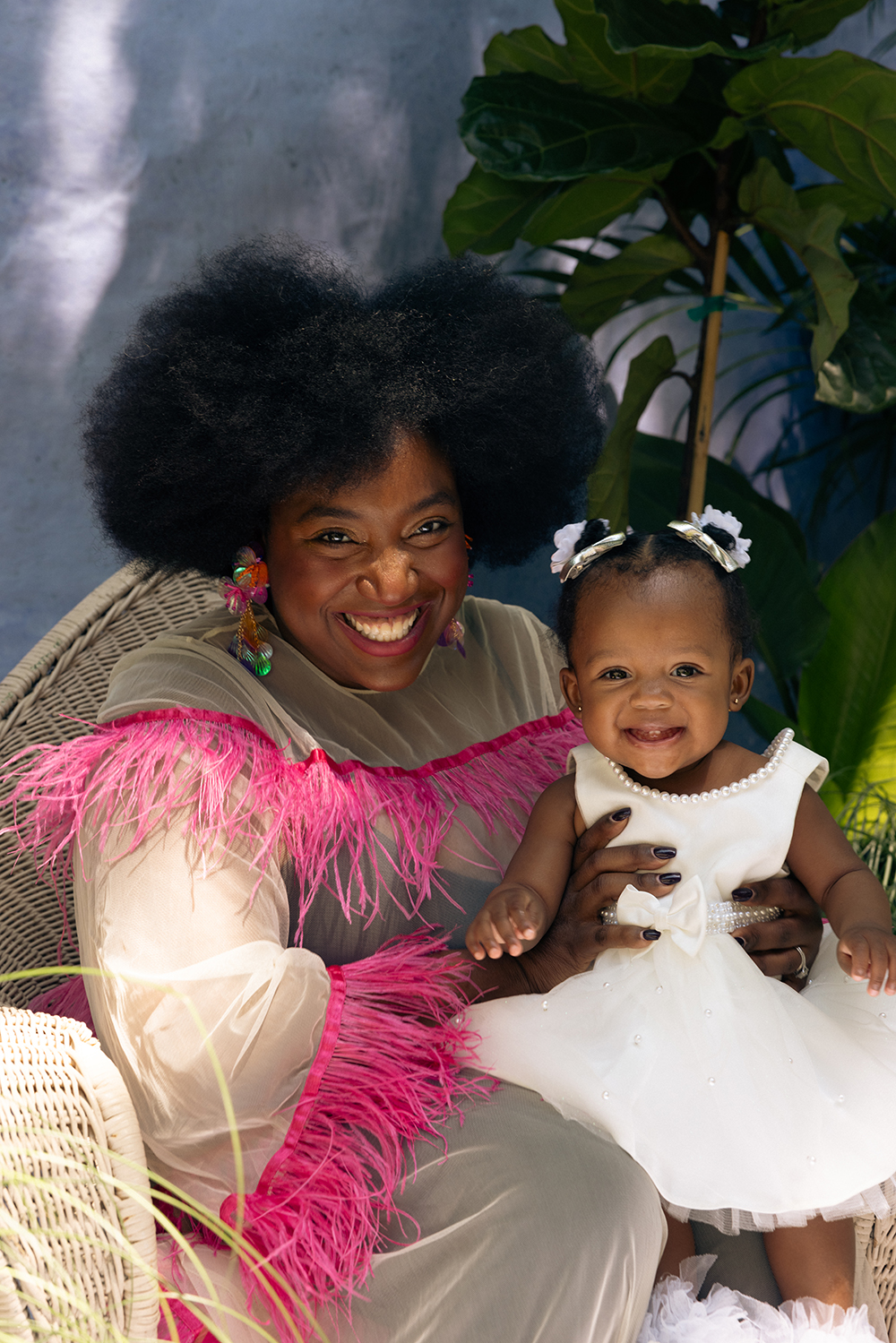
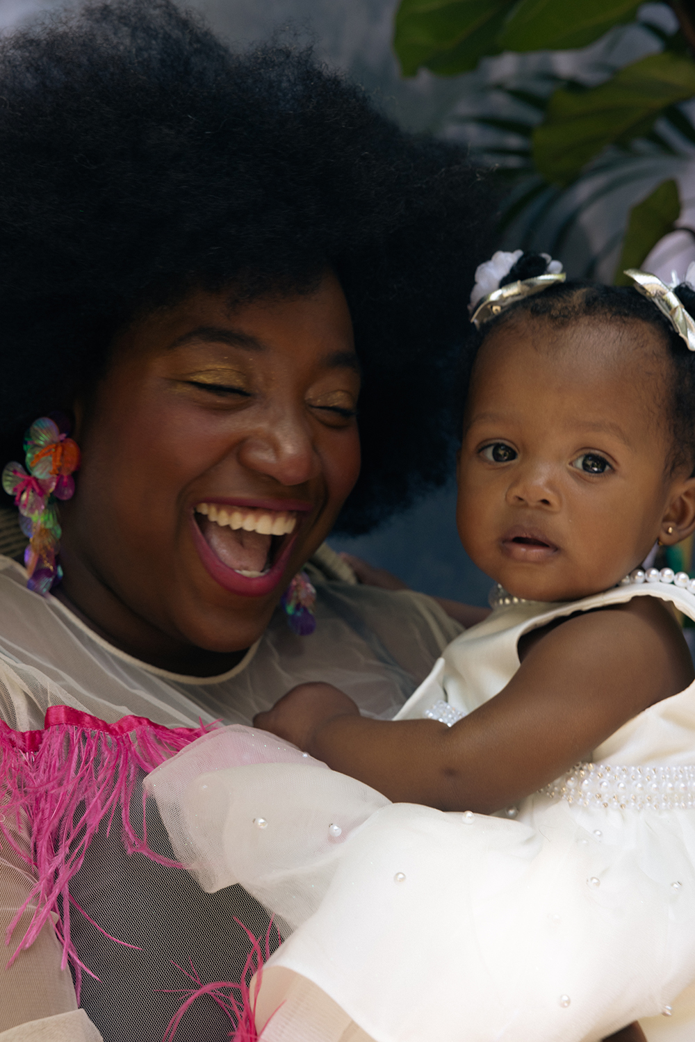
Here are a few examples of how this plays out:
Avoid stark contrast between family members, like all white on one person and then head-to-toe black on another. That kind of mismatch can break visual cohesion in photos, especially if you're shooting in natural light.
Instead, focus on balance. You’re not dressing a choir here; you are capturing a moment in time. Everyone should feel like themselves, but slightly more polished and visually connected.
That’s where the magic happens.
Your family isn’t one-size-fits-all, and your photos shouldn’t be either. Book a session with FAM NYC and celebrate the moments (and the outfits) that make your story yours.
Mix Textures for Depth and Visual Interest, Not Uniformity
If everyone wore the same denim and tee combo, your family photos may feel flat, even if the color palette is perfect. That’s where textures come in. Mixing fabrics like knits, denim, lace, or velvet adds visual depth, dimension, and interest to your images, without needing anyone to match.
A great way to start is by pairing contrasting materials. Think:
- A chunky knit cardigan over a flowy cotton dress
- A velvet hair bow next to a denim jacket
- A linen shirt layered under a soft sweater
These tactile combinations catch light in different ways, adding a natural richness to your photos while still feeling balanced. So, even the smallest shift in fabric can turn a family photo from simple to striking.
You don’t need to go overboard here. Aim for 2 to 3 textures per person, and coordinate across the group for cohesion. One person can wear a denim jacket, another a waffle-knit pullover, while someone else can bring in a gauzy scarf or a corduroy vest.
The variation feels intentional, never chaotic.
When in doubt, let the season guide your choices:
- In fall or winter, go cozy with wool, suede, or corduroy.
- In spring and summer, keep things breezy with cotton, linen, or light knits.
Accessories can pull extra weight here, too. A woven belt, leather boots, or even a cozy throw blanket can act as subtle texture pops that elevate your look without drawing too much attention.
Remember, the goal isn’t to compete. It’s to complement. Layering textures allows each family member to wear something they love, while still creating a unified look that feels fresh, modern, and true to who you are.
Use Patterns Strategically (Without Overdoing It)
Patterns are a powerful styling tool in family photos, but just like spices in a recipe, a little goes a long way. The key is balance:
Let patterns add personality and dimension without taking over the entire frame.
A helpful rule to follow here is the 2:1 ratio: for every one person in a patterned piece, dress two others in solids. This creates a natural rhythm across the group and helps the eye move smoothly from one person to the next without any outfit stealing the show.
Here’s an example:
- One person wears a floral dress
- Another wears a solid shirt and jeans
- A third wears a neutral sweater and corduroy pants
This setup feels cohesive, not copy-pasted.
It’s also important to mix pattern scale.
For example, a large plaid shirt and a tiny floral print can work beautifully together, especially if they share similar hues. But having several people in identical prints, especially something bold like matching buffalo plaid, could feel more like a holiday card costume than a timeless portrait.
Here are a few tips for styling patterns like a pro:
- Stick to one bold pattern per group
- Mix it with small-scale or subtle patterns (like pinstripes or micro-dots)
- Keep the color palette tight; shared tones unify the look even when prints vary
- Avoid loud patterns that might distract from faces or emotion
Patterns are at their best when they support your family’s dynamic, not upstage it.
When used intentionally, they bring the right amount of visual energy, while still keeping the focus where it belongs: on your connection.
Accessorize to Tie the Look Together
Once your outfits are set, it’s the accessories that pull everything into focus. These small details, like hats, scarves, belts, shoes, and jewelry, can help unify your family’s look while letting each person’s style shine through.
The goal isn’t to match accessories across the board. It’s to find intentional touches that echo your color palette and add depth to the overall aesthetic.
Here are a few examples:
- A woven belt in a shared neutral
- A cozy scarf in your accent color
- Shoes in similar earth tones across the group
- A hat that adds texture (like felt or corduroy) without clashing
Jewelry can be especially powerful. A simple chain, an heirloom ring, or an engraved bracelet can speak volumes without shouting for attention. Just keep in mind that less is more. One or two thoughtful pieces per person is plenty.
Avoid accessories that are too flashy, trendy, or logo-heavy, as these can distract from the connection and emotion you're trying to capture. Remember:
Your photos should feel timeless, not tied to a passing moment on TikTok.
If you're not sure what to include, choose accessories that either add texture (like knit beanies or leather boots) or subtly reinforce your chosen palette. Even something as simple as coordinating shoelace tones can help create visual cohesion without anyone noticing why it works so well.
When done right, accessories can help your family look coordinated, rather than cookie-cutter, adding personality, warmth, and story to every frame.
Plan Outfits With Your Photoshoot Setting in Mind
Your location does more than provide a backdrop; it quietly sets the tone for the entire session. And when everyone’s outfits complement that setting, everything simply clicks. The colors feel richer, the vibe feels intentional, and your photos come out timeless.
Start by taking cues from the environment’s color story. Here’s how to match your outfits to a few common locations:
- Beach: Go for light, airy neutrals; think whites, soft blues, sand tones, or pale peach. These reflect sunlight beautifully and echo the calm, natural palette of the ocean and sky.
- Park or Forest: Lean into warm earth tones like rust, cream, olive, camel, or soft mustard. But skip solid green if you’re surrounded by trees; you’ll blend in instead of standing out.
- City Streets: Opt for deeper hues and cleaner lines. Navy, charcoal, muted jewel tones, and sleek neutrals (like camel or black) often look polished against brick, concrete, or steel.
- Studio or Indoors: Match the mood of your space. If it’s minimal and bright, keep tones lighter and cohesive. If it’s moodier, bring in textures and deeper shades to add depth.
Don’t forget the practical side of things. Be sure everyone can move and actually feel comfortable in what they’re wearing. If you're shooting on cobblestone streets or in a grassy field, swap heels for boots or flats. Choose fabrics that breathe, layer easily, and won’t wrinkle or ride up.
Finally, consider doing a quick test run. Use your phone camera in a similar setting or lighting to see how your colors play with the environment. A thoughtful approach and a bit of planning guarantee everyone will look cohesive, comfortable, and perfectly in harmony with your setting.
Ready to capture the moments that matter most? Book a family photoshoot with FAM NYC and celebrate your unique dynamic, outfits and all.
What Not to Wear for a Family Photoshoot
When you’re choosing outfits for your family session, knowing what not to wear is every bit as important as picking what looks good. These photos are meant to last, so aim for looks that feel like you but will hold up beautifully over time.
Here are a few things to avoid:
- Logos or Large Graphics: Skip anything with big branding, slogans, or cartoon characters. These elements pull focus and date your photos fast.
- Neon or Ultra-Bright Colors: While vibrant colors can be fun, they may reflect harshly on skin and clash with natural surroundings. Stick to softer, earthy, or muted tones that complement your environment.
- Too Many Bold Prints: A single statement piece? Great. But dressing everyone in loud patterns or clashing florals? That’s visual chaos. Use bold prints sparingly and mix them with solids and subtle textures for balance.
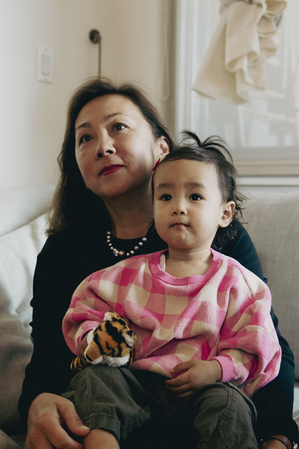
- Identical Outfits: Matching jeans and white tees might’ve worked in the '90s, but today’s approach is more about coordination than uniformity. Aim for a shared palette and vibe, not carbon copies.
- Uncomfortable Shoes or Fussy Clothes: If it pinches, slips, or requires constant adjusting, that’s going to show. Choose clothes everyone can move and play in comfortably, especially with the kids involved.
- Overly Trendy Pieces: Think timeless over trendy. Your photos should still look and feel beautiful and relevant five, ten, or even twenty years from now. So, skip those TikTok fashion moments and lean into styles that feel effortless and classic.
When in doubt, try things on ahead of time, snap a few test photos, and trust your gut. If anything feels too loud, too stiff, or simply not you, leave it behind.
The best photos come from feeling present, not from fussing with a hemline or hiding a neon shirt.
Every detail tells a part of your story. From fabrics to little touches, we’ll help you style a session that feels timeless and true to your family.
Bring Your Story Into Focus
The best family photos are never about perfection. They are about connection, humor, and all those small, unrepeatable moments that make your family unique.
When you’re ready to capture it all in a way that feels effortless and true, FAM NYC Photography is here to help.
Let’s create images you’ll love for years to come. Book your session today and start planning a photoshoot that feels beautifully yours.